Saturday, July 30, 2011

Where is the economy headed?

Jon Hilsenrath and Sara Murray have an interesting piece (see here) in the Wall Street Journal today about the likely implications of the economic data that was released this week.  The piece has a very interesting graph (see below, click to enlarge).


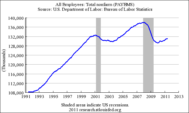
Referring to the graph they say:

Among the reasons the economy is so vulnerable: Debt-laden consumers with scant savings are prone to slash spending when their incomes drop. Household confidence is more fragile. Individuals are moving less often to find jobs, making it harder for firms to fill vacancies. And the government, for decades the rescuer of last resort with interest-rate cuts, tax reductions and spending increases, has run out of string.
 
The authors do a nice job of noting the actions that have been taken in past recessions by the federal government to cushion the business cycle and to encourage stronger recoveries from recessions.  As they say, it now appears (given the obsession with the national debt) the government is "out of string."

Once upon a time there was a view held by both Republicans and Democrats that the government exercised a useful function by helping to "cushion" downturns and "encouraging" recovery from those downturns.  That consensus has been swallowed up by a political obsession with the national debt that is a mix of ideological fanaticism and economic nonsense.  What does it all mean?  Like most, I'm not really sure.  As the graph from the article demonstrates, the role of the government in economic growth has been undeniable in the past.  What happens when you attempt to prohibit that role?  We aren't sure.

Perhaps, as they say, this too shall pass.  In the mean time, we are left with governmental dysfunction unlike anything I have seen in my adult life.

Friday, July 29, 2011

Economist's Big Mac index

The Economist's "Big Mac Index" (see here) is always interesting (see chart below, click to enlarge).  The Economist describes it as follows:

THE Economist’s Big Mac index is a fun guide to whether currencies are at their “correct” level. It is based on the theory of purchasing-power parity (PPP), the notion that in the long run exchange rates should move towards the rate that would equalise the prices of a basket of goods and services around the world.

New York Times on the debt issue

The New York Times has a very informative Q. and A. on the debt ceiling (see here).  In particular the following graph (click to enlarge) catches your eye.  I encourage you to read go to the post and read all the Q. and As.


The following Q. and A. might be "news" to some:

Q. Republicans and Democrats alike keep talking about the need to reduce the federal deficit. Won’t refusing to raise the debt limit cut the deficit?
 
A. No. The debt limit, or ceiling, which is the amount that the nation is allowed to borrow, must be raised if the United States is to pay for all the things that Congress has already bought: the spending in the budget bills it has already passed, the Social Security checks promised to retirees, the payments due to private companies with federal contracts and the interest on bonds it has sold. Washington has long spent more money than it takes in, and planned to make up the difference with borrowing. Both parties agree that this cannot go on forever. But if the debt limit is not raised, it will not cut the nation’s deficit or allow the government to get out of its existing obligations. It will simply make it impossible to borrow the money that the government needs to pay for them.

More on the jobs deficit

Laura D'Andrea Tyson over at the blog Economix (see here) has another post on the jobs deficit (I know, it seems that nobody - not Washington and not the American public - is listening).  She points out that:

The magnitude of the jobs crisis is clearly illustrated by the jobs gap – currently around 12.3 million jobs. . . . That is how many jobs the economy must add to return to its peak employment level before the 2008-9 recession and to absorb the 125,000 people who enter the labor force each month. At the current pace of recovery, the gap will be not closed until 2020 or later.

She observes that recovery from the type of recession we have experienced (debt and balance sheet driven) has been (historically) very slow.  So, once again, another voice questions why there is so much emphasis and energy being expended over the debt limit when the nation has a tremendous job deficit.

A cynical person might begin to conclude that the American public is about to get exactly the kind of government they seem to want so disparately:  one that isn't interested in the plight of working men and women (and, no, the Tea Party isn't interested in them either).

Tuesday, July 26, 2011

More data on debt crisis

The folks over at the blog Political Calculations (see here) have an interesting post with graph on the debt issue (click on graph to enlarge).


They state that:

At its peak in 2009, we find that the gap between the federal government's spending and its tax collections is much more heavily weighted toward the side of excessive spending. With spending accounting for approximately 62% of the pre-crisis gap, we find that excessive spending by the U.S. federal government in the years since 2007 is primarily responsible for the current debt crisis.

Monday, July 25, 2011

Data on the debt

While I no longer believe that "data" matters to the ongoing debt debate fiasco in Washington, I do still hope the facts actually matter to some.  Menzie Chinn over at the blog Econbrowser (see here) has a nice graph showing some history of the national debt (publicly held as a fraction of GDP).


As the graph shows, the fraction began its steep rise in 2008.  An article in the New York Times (see here) shows how this has happened.  The following graph is very instructive.


I understand that it is time to stop the "blame game," but that is unlikely to happen until people are willing to face the facts, accept that both parties have been unwilling to address long-term spending restraint, and recognize that compromise (yes, that dirty word these days) is the only way to begin to effectively make real changes.  The United States has both a spending and a revenue problem.  Both must be addressed.

If you are interested in a short description of how we came to this point, I suggest the essay today by Felix Salmon (see here).  Mr. Salmon succinctly describes the path we have been on for four decades regarding the debt limit.  He says:

The lion’s share of the blame here belongs with the Republicans in general, the House Republicans in particular, and the Tea Party caucus within the House Republicans most of all. But it’s not like these people’s existence or intransigence was any great secret. And so the White House tactics over the course of the past few months look dangerously naive.

As I have said before, we need some adults in Washington (and both parties, nationally and locally) willing to face the facts and focus on real changes.  By "adults" I mean people who don't look at the data and then pretend it doesn't exist.  I'm still waiting...

Sunday, July 24, 2011

What about the deficit?

With all the political focus presently on the national debt, what about the deficit?  Teresa Tritch over at the New York Times investigates this question (see here).  She says:

With President Obama and Republican leaders calling for cutting the budget by trillions over the next 10 years, it is worth asking how we got here — from healthy surpluses at the end of the Clinton era, and the promise of future surpluses, to nine straight years of deficits, including the $1.3 trillion shortfall in 2010. The answer is largely the Bush-era tax cuts, war spending in Iraq and Afghanistan, and recessions.

Her articles includes some informative data and graphs.

What we should be doing instead of "debt limit chicken"

Robert Shiller has a thoughtful essay in the New York Times today (see here) about what Washington should be doing instead of the debt limit debate.  He says:

Over the long haul, we should engage in balanced support of the economy, find worthwhile jobs for the unemployed and not inject stimulus for its own sake. That means we need tax increases matched by higher expenditures on public goods. Of course, both ideas aren’t very popular right now — but they should be. Granted, they won’t balance the budget immediately; trying to do so would damage the economy. Instead, we should plan to restore budget balance eventually, with matching additions on both sides of the ledger. 

It is a measured and reasonable article, two characteristics absent from both Republicans and Democrats right now.

Saturday, July 23, 2011

Debate on worth of college continues

You may or may not be aware that a debate has been going on for some time now in traditional news media and the blogs about the value of a college education.  The latest round is a post by Catherine Rampell over at the New York Times blog Economix (see here).  She produces the chart below from the Bureau of Labor Statistics (click to enlarge).


She says:

Take a look at the right side of the chart, which shows earnings by education. The median weekly earnings for college graduates are $1,043. Not bad, especially when you consider that the median weekly earnings for a high school graduate are $643
.
What’s more impressive, though, is that even the economic underachievers among college graduates earn more than the typical high school grad: A college graduate at the 25th percentile makes $730 per week, which is still 13.5 percent more than the median high school grad.

Odds of finding a job within a month

David Wessel has a post (see here) over at the Wall Street Journal about some estimates from the folks at the Federal Reserve using data from Bureau of Labor Statistics regarding the odds of finding a job this month based on how long you have been unemployed.  The results (see graph below, click to enlarge) aren't pretty.

Friday, July 22, 2011

Mississippi Department of Education releasing test results

The Mississippi Department of Education released test results today for the Mississippi Curriculum Test, 2nd. Edition (see here).  Scroll to the bottom of the page of the news release and there is a link that will take you to a searchable database of the test results.

Below is a graph I generated from the data for Language Arts (Grades 3 through 8).  Click on graphs to enlarge.


Also, below is a graph for Mathematics (Grades 3 through 8).

Review of "Faculty Lounges"

Frank Gannon over at the Wall Street Journal (see here) has a review of the new book Faculty Lounges by Naomi Schaefer Riley.  Ms. Riley is well known for her strong opinions.  About the book, Mr. Gannon says:

In "The Faculty Lounges," Naomi Schaefer Riley, a former member of the Journal's editorial-page staff, takes up the question of academic tenure—what it was intended to be, what abuses it now invites and whether it is a good idea at all. Along the way she addresses vital questions about higher education in America and its future—indeed, about the very idea of a university.

In the book, according to Mr. Gannon, the pervasive use of adjuncts is given a serious look.

One administrator noted that "Wal-Mart is a more honest employer of part-time employees than are most colleges and universities" and admitted that adjunct teachers are a "highly educated working poor." 

Although I'm not usually a fan of Ms. Riley's work, I may have to read this one.

Thursday, July 21, 2011

Young person's guide to Social Security

The folks over at the Economic Policy Institute (see here to download pdf) have produced "A Young Person's Guide to Social Security."  Their reasons for developing the guide are:

Many young people don’t think Social Security will be there for them when they retire. Coupled with the doubt about Social Security’s longevity is a general apathy toward learning its basic functions and how it operates. Young people are uninformed and therefore misinformed. They do not understand how Social Security works, who it affects, and how it fits into their future plans.

I itch ... therefore I am ... not alone

I've been spending lots of time on my deck this summer and, well, itching.  I had convinced myself that I wasn't getting bitten more, just more aware of the bites.  Maybe not.  According to an article (see here) in the Wall Street Journal, I may have some new "guests" on the deck (click on graph to enlarge).

Charitable deductions by income

Over at the blog Political Calculations (see here) they have a graph (see below, click to enlarge) showing data on charitable deductions (total dollar value) by income (data from Joint Committee on Taxation).


While there is research that shows that lower incomes give a higher percentage of their income to charity, the total dollar value is skewed to the upper incomes.

The challenge of long-term unemployment

Sara Murray over at the Wall Street Journal (see here) has an article with data by state about the continuing challenge of long-term unemployment.  The article has a very interesting interactive graph that lets you explore the data by state.  The following information for Mississippi is given.

Wednesday, July 20, 2011

Graph on mortgage interest deductions

The folks over at the blog Political Calculations (see here) have an interesting graph on mortgage interest deduction by income (see below, click to enlarge).  About the graph, they say:

As you can see in the chart above, the greatest amount of "losses" to the federal government, at least, from the perspective of a hypothetical government overlord, is represented by taxpayer households who have incomes in the range between $50,000 and $150,000.

Marshall Ramsey cartoon ... I guess we might as well laugh

Below is a cartoon by Marshall Ramsey that hits too close to home regarding the debt ceiling fiasco.

Tuesday, July 19, 2011

Delta announces service cuts

It appears that Delta Airlines has plans to end service to 24 small airports (see New York Times article here and Delta announcement is here).  Mississippi will lose Delta service to three airports (Greenville, Tupelo, and Hattiesburg).  See chart below from the New York Times (click to enlarge).

The New York Times article states that:

Nationally, all major airlines have been reducing and sometimes eliminating flights altogether in small cities, as the industry concentrates much of its service in 29 major hubs, which now account for 70 percent of all passenger traffic, according to the Federal Aviation Administration.

Monday, July 18, 2011

The sad, sad cheating story in Atlanta

Michael Winerip has a very interesting (and disturbing) piece in the New York Times (see here) about the cheating scandal in Atlanta.  The story just gets worse as more details emerge.  The following description of the managerial environment in the Atlanta School District especially struck me.

Investigators described how Dr. Hall had humiliated principals who didn’t reach their targets. Every year she gathered the entire district staff at the Georgia Dome. Those from schools with top scores were seated on the Dome floor; the better the scores, the closer they sat to Dr. Hall. Those with low scores were relegated to sitting in the stands. 

Principals, in turn, humiliated teachers. At Fain Elementary, the principal, Marcus Stallworth, had teachers with low test scores crawl under a table, according to the report. At Parks Middle School, teachers who refused to join “changing parties” that were organized by the principal, Christopher Waller, to doctor answer sheets were isolated or let go, the report said.

What can I say about this?  It is incredibly sad.   I have grown weary of school administrators (K - 12 and higher education) droning on about how schools should be run like businesses (this from people who almost always have no idea how businesses are actually run).  And what do they think running a business looks like?  Evidently, they think the approach of Frederick Taylor (now 100 years out of date) is the proper model - threaten and provide large incentives.  How's that working out for us?  As public school teachers salaries have stagnated over the past 30 years, administrator salaries (and the number of administrators) have soared.  Just sad...

Sunday, July 17, 2011

Some graphs to consider

How long have economists been saying that part of the budget problem is revenue related.  The folks over at the blog Calculated Risk (see here) have a clear graph (see graph below, click to enlarge).


Is anyone listening?

And over at the blog Modeled Behavior (see here), Karl Smith reminds us what has happened to jobs in last few years (click to enlarge).


He says:

Currently we have fewer people working in America than just before the dot-com bust. Taken all together this has just been a brutal decade on the jobs front.

Finally,  take a look at the research over at FactCheck.org (see here) on spending and revenue data.  Below is one of the interesting charts they have posted (click to enlarge).

Your data is . . . being tracked

Ylan Mui over at the Washington Post has a very interesting article (see here) about whose looking at your data.  The bottom line is that an entire industry has developed to track our data (all kinds of data).  Mr. Mui says:

Federal regulations do not always require companies to disclose when they share your financial history or with whom, and there is no way to opt out when they do. No standard exists for what types of data should be included in the fourth bureau or how it should be used. No one is even tracking the accuracy of these reports. That has created a virtually impenetrable system in which consumers, particularly the most vulnerable, have little insight into the forces shaping their financial futures.

It isn't just your Facebook account that should concern you.

Why the Great Recession continues

David Leonhardt over at the New York Times has an informative piece (see here) about the "un-recovery" from the Great Recession.  As I have stated before, Washington continues the game of "debt limit" chicken while the nation continues to struggle to recover from the recession.  Mr. Leonhardt has a very instructive graph (see below, click to enlarge) that shows some historical data on discretionary spending by consumers.


In my opinion he is correct to focus on the recent data on consumer spending.  Falling consumer spending is both the real culprit and the one that isn't getting much attention from policy makers.  He says:

But the real culprit — or at least the main one — has been hiding in plain sight. We are living through a tremendous bust. It isn’t simply a housing bust. It’s a fizzling of the great consumer bubble that was decades in the making. 

 He points out what Washington should be doing with the debt debate that it isn't.  The article is worth reading.

Do we have a "clash of generations?"

Thomas Friedman in the New York Times today (see here) has an article that suggests that what a lot of the debt debates (the U. S. and Greece) have in common is a fundamental class of generations.  He quotes the scholar David Rothkopf:

“When the cold war ended, we thought we were going to have a clash of civilizations. It turns out we’re having a clash of generations.” 

I confess that Mr. Friedman is not one of my favorite writers, but he writes about something that I have been thinking about for some time now.  As I have read and listened to much of the "noise" in Washington lately, it has occurred to me that what is really in play is the belief that we can "have it all."  Moreover, many of the positions being cultivated by both parties just aren't supported by the data.  Specifically, (1) the data shows that the effective rate of federal income taxes for American taxpayers is lower than it has been in 30 years, yet the Republicans continue to act as if that data just doesn't exist and that they have some "mandate" to continue to perpetuate the view that taxes are the economy's main problem, and (2) the data clearly shows that entitlement programs are growing at a rate that is unsustainable, yet Democrats continue to act as if the data are irrelevant to their "principled" arguments about "fairness."  At times Republicans and Democrats remind me of two toddlers shouting "mine."

Mr. Friedman (ever the writer with a punch line about China) concludes his article as follows:

What happens is that both the American and European dreams hang in the balance. Either we both put our nations on more sustainable growth paths — which requires cutting, taxing and investing for the future — or we’re looking at a world in which democracies are going to turn on themselves and fight over shrinking pies, with China having a growing say over how big the slices will be.

We need two things right now:  (1) some old-fashioned statesmen (and women) who are willing to take on the false claims of their parties and U. S. citizens and (2) some informed citizens in both parties who are willing to confront the facts and behave responsibly.

Saturday, July 16, 2011

The increasing cost of law school

David Segal over at the New York Times has an article (see here) on the increasing cost of law school even in a weak job market for law school graduates.  The article contains the following graph (click to enlarge).

Data on in-state vs out-of-state students by State

Kevin Helliker over at the Wall Street Journal (see here) has an article today about states who draws lots of college students from other states (emphasizing the success of North Dakota in drawing students from other states).  It has an interactive data table showing the number (and percentage) of in-state students versus out-of-state students.  According to the data, about 86% of Mississippi public university students are "in-state" and about 14% are not.  The article also contains the map below (click to enlarge).

Friday, July 15, 2011

Life expectancy and health care spending per capita

Over at the blog Consider the Evidence (see here) Lane Kenworthy has a very interesting graph that shows trends in life expectancy vs health care spending per capita (see below, click to enlarge).


Mr. Kenworthy says:

Our gain in life expectancy per additional health spending is much smaller than in other countries, particularly after the early 1980s when we reached expenditures of about $2,500 per person (in 2005 dollars) and life expectancy of around 74-75 years.

Mapping project from the New York Times

The New York Times has an interactive "mapping project" that is very informative.  Click here.  The project allows one to generate maps to investigate things like race and ethnicity, income, housing and families, and education.  Below (click to enlarge)  is a "median income" map of the Jackson, MS area.  The data for the maps is from the Bureau of the Census' American Community Survey.  Kudos New York Times.

Thursday, July 14, 2011

A historical look at marginal tax rates on the highest individual income tax bracket

The economist Menzie Chinn has a post over at Econbrowser (see here) with a graph illustrating the historical marginal tax rates for the highest individual income tax bracket.  The graph is shown below (click to enlarge).

New data on grade inflation in American colleges

Catherine Rampell is reporting this morning (see here) on a new paper by Stuart Rojstaczer and Christopher Healy (see their website here) detailing the history of grade inflation in American colleges and universities.  One of the graphs from the paper (see below, click to enlarge) essentially tells the story.


 Mr. Rampell says of the graph:

As you can see, public and private school grading curves started out as relatively similar, and gradually pulled further apart. Both types of institutions made their curves easier over time, but private schools made their grades much easier.

Are there any signs of improved economic conditions?

Jared Bernstein (see here) points us to a paper from the Center for Labor Market Studies at Northeastern University (download paper here) that might contain some hopeful signs of economic improvement.  The report contains the following very interesting graph (see below, click to enlarge).


Mr. Bernstein says about the graph:

Profits typically lead jobs and wages in a recovery, but this seems a lot more serious than a matter of leads and lags.  With so much slack in the job market, workers have zippo bargaining power and for at least the last thirty years in this economy, when such conditions prevailed, growth did an end run around the middle class.

So, there may be some good news - and, well, some not-so-good news.  The dramatic increase in corporate profits that we have seen of late may indicate the economy is poised to began growing again.  But as Mr. Bernstein says, we will still be faced with the issue of flat wage growth for workers.

Wednesday, July 13, 2011

OECD data on health care spending

The Organization for Economic Cooperation and Development (OECD) has a new study (see here) on health care spending.  Below is a graph (click to enlarge) from the study that compares total health care spending as a percent of GDP for OECD countries for 2009.

The study finds that:

In 2009, there were large variations in how much OECD countries spent on health and the health spending share of GDP. The United States continued to outspend all other OECD countries by a wide margin, with spending on health per capita of $7960. This was two-and-a-half times more than the OECD average of $3223. 

I have posted previously about the new study from the National Institute of Health Care Management (see here) that investigates health care spending in the United States.  They have a graph (see below, click to enlarge) that details the cost drivers for the high cost of health care in the U. S.

Pew report on drug manufacturing abroad

The Pew Charitable Trust's Health Group (see here) has a new report "After Heparin: Protecting Consumers from the Risks of Substandard and Counterfeit Drugs."  The report states:

The number of drug products made outside of the United States doubled from 2001 to 2008, according to FDA estimates. The FDA estimates that up to 40 percent of finished drugs used by U.S. patients is manufactured abroad, and 80 percent of active ingredients and bulk chemicals used in U.S. drugs comes from foreign countries. Increasingly, the United States relies on drug manufacturing in developing countries—mainly China and India. Globalization, increased outsourcing of manufacturing, the complexity of pharmaceutical distribution and the existence of criminal actors willing to capitalize on supply chain weaknesses has created the potential for counterfeit or substandard medicines to enter the system and reach patients. As evidenced by the adulteration of heparin and other case studies outlined in this report, these rare but potentially serious events can have grave consequences.

The Great Recession and America's Middle Class

Rex Nutting has a short piece over at Market Watch (see here) with some interesting data and commentary about the impact of the Great Recession on the middle class.  Much has been said about this of late, but too many people seem to accept it as a natural consequence of capitalism.  That is, they see growing income disparity as the trade-off one must make for a vibrant capitalism.  I don't buy it.  As the U. S. economy grew after WWII, the middle class shared greatly in the gains; thus it doesn't seem to me that growing income disparity is a "necessary" consequence of a vibrant capitalistic economy.

Mr. Nutting has the following graph in his post (click to enlarge).


It seems to me there are several reasons for this (none of them - in my mind - necessary or inevitable).  As Mr. Nutting puts it,

Their wages have been flat after adjusting for inflation. In the late 1960s, the 20% of families right in the middle were earning almost their full share of the pie: they had 17.5% of total income. Their share has been falling steadily ever since. Now, that 20% is earning just 14.6% of all income. Meanwhile, the top 5% captured a growing share, going from 17% in the late 1960s to 22% today.

Tuesday, July 12, 2011

SF Fed provides good summary of impact of the "Great Recession"

Kevin J. Lansing of the Federal Reserve Bank of San Francisco (see here) has a very brief and clear description of the impact of the Great Recession.  One of his chart's (Figure 2, Real Household Net Worth per Person) is posted below (click to enlarge).


He says:

Figure 2 shows that the decline in household net worth per person was more pronounced in the Great Recession than in the two previous recessions, as both stocks and housing experienced severe bear markets. This decline in net worth helps explain the drop in consumption and the increase in personal saving since 2007...

What does a government "default" mean?

Click here to access an informative interview with Mark Zandi (economist at Moody's Analytics) about the issue of a government default.

Kathleen Madigan offers an important reminder

Over at the WSJ blog Real Time Economics (see here), Kathleen Madigan states:

For an individual company, keeping down labor costs is a smart move. But the U.S. economy as a whole suffers when weak labor markets hold back consumer spending. The same companies that are laying off workers today will soon wonder why they have no customers later on.

Graph summarizes the jobs situation

Catherine Rampell over at Economix (see here) has a graph that pretty much summarizes the jobs challenge (see below, click to enlarge).

 
Lawrence Mishel at EPI (see here) summarizes as follows:

The total number of job openings in May was 3.0 million, and the total number of unemployed workers was 13.9 million. The ratio of unemployed workers to job openings was 4.7-to-1 in May, as it was in April. The job seekers ratio has been above 4.3-to-1 for 29 consecutive months, meaning that for nearly two-and-a-half years, there has been no available job for at least three out of four unemployed workers. In the last recovery, which followed the 2001 recession, the ratio of unemployed to job openings never exceeded 2.8-to-1.

Bruce Bartlett worries about a repeat of 1937 - 1938

Bruce Barlett has an interesting post (see here) in which he worries that U. S. policymakers could be poised to make the same mistake that the Roosevelt administration did in 1937 and 1938.  He says:

This combination of fiscal and monetary tightening – which conservatives advocate today – brought on a sharp recession beginning in May 1937 and ending in June 1938, according to the National Bureau of Economic Research. Real G.D.P. fell 3.4 percent in 1938, and the unemployment rate rose to 12.5 percent from 9.2 percent in 1937.

Greece ... and now Italy

The New York Times is reporting (see here) that concerns are increasing that the debt challenges in many small European countries may be moving toward big economies like Italy.  The piece has a very interesting graph (see below, click to enlarge).

Sunday, July 10, 2011

Good returns ... if you can get elected

Well, here is another entry for the "elected officials aren't like the rest of us" diary.  A group of researchers have published a paper (see it here) that contains their findings regarding the trading of common stocks by members of the House of Representatives.  Guess what they found (OK, you don't have to guess!).  Their findings are:

Overall we find that the common stocks purchased by Members of the U.S. House of Representatives earn statistically significant positive abnormal returns. Our results indicate that Representatives, like Senators, also trade with a substantial information advantage.

 Is it too late to file to run for something?

How has the "bailout" turned out?

Allan Sloan and Doris Burke over at the Washington Post have a piece (see here) in which they investigated the results of the bailout.  They have researched the "money trail" and their findings are quite surprising.  They conclude the piece as follows:

When our boss assigned us to find out how much the financial rescue cost, we expected to find a monumental loss because Fannie Mae and Freddie Mac seemed like a bottomless pit. Instead, we discovered that bailout profit payments from the Fed — which we hadn’t previously thought of as a profit center — are virtually certain to exceed taxpayer losses on Fannie and Freddie. We were surprised — and pleased — to discover taxpayers showing a profit on the bailout. We hope that you are, too.

Update: Bob Eisenbeis over at The Big Picture (see here) takes issue with Sloan and Burke's conclusions and use of data.

Have the unemployed become invisible?

Catherine Rampell has an interesting piece at the New York Times (see here) in which she asserts that in some ways (and unlike similar times in the past), the unemployed have become almost invisible.  She says:

In some ways, this boils down to math, both economic and political. Yes, 9.2 percent of the American work force is unemployed — but 90.8 percent of it is working. To elected officials, the unemployed are a relatively small constituency. And with apologies to Karl Marx, the workers of the world, particularly the unemployed, are also no longer uniting. 

Nor are they voting — or at least not as much as people with jobs. In 2010, some 46 percent of working Americans who were eligible to vote did so, compared with 35 percent of the unemployed, according to Michael McDonald, a political scientist at George Mason University. There was a similar turnout gap in the 2008 election. 

No wonder policy makers don’t fear unemployed Americans. The jobless are, politically speaking, more or less invisible.

I have been wondering about this for months now.  That is, where are the influential voices that speak for the unemployed?  Mainly, I have found them among a select group of economists who continue to write about this on their blogs.  The jobs report this week estimated the unemployed to number over 14 million!  That number, of course, doesn't include the large number that have simply given up searching for a job.  But, again, why hasn't this become a main staple of our national conversation?  The people of this country seem more interested in a trial in Florida than the plight of millions of their fellow Americans.  I don't get it.

Tyler Cowen on the challenges facing Greece

Tyler Cowen has a good piece over at the New York Times (see here) about the options facing Greece right now.  They aren't pretty.  Cowen says:

Relative to the size of its economy, the total Greek spending cuts now being contemplated are proportional to the United States government cutting $1.75 trillion. (Even if you believe government needs to shrink, it would be hard to pull off such a big change on short notice.) Right, now Greece’s gross domestic product is falling at a rate of more than 3 percent a year. 

Was Friday's jobs report a warning?

David Altig over at the Federal Reserve Bank of Atlanta (see here) asks: "Is the employment report a game changer?"  He has a chart that will make you uncomfortable (see below, click to enlarge).
About the chart, he says:

The bottom line of this chart is that there has been a pretty reliable relationship between sustained bouts of sub-2 percent growth and U.S. recessions (indicated by the gray shaded areas). In fact, over the entire post-World War II era, periods in which year-over-year real GDP growth below 2 percent have been almost always associated with downturns in the economy. 

Mark Thoma over at Economist View (see here) has some clear thoughts about the above chart and the meaning of the jobs report.  He considers the question:  "How close are we to a second recession?"  He concludes with the following:

The White House and Congress are devoting all of their energy to deficit reduction rather than job creation. As highlighted by yesterday's horrid jobs report, and the fact that deficit reduction will place an additional drag on the recovery, that's something they may come to regret.

Saturday, July 9, 2011

The issue for the economy is unemployment

Over at the blog Rortybomb (see here) there are some very illustrative graphs about the real issues in the economy (unemployment and demand).  I use the word "real issues" as compared to all this political rhetoric out of the White House and the Republicans.  One of the more interesting graphs is shown below (click to enlarge).
Mike Konczal (Rortybomb) states:

You have to go back to pre-1988 to find an era when there were a fewer percentage of women working than there are right now.

Meanwhile, how’s the economy working out for those with jobs?  Average weekly earnings of all private employees dropped from $791.20 to $788.56.  We can’t really have an inflationary spiral based on prices and wages if wages are decreasing.  Also without a buildup in wages, it’s harder to argue that we are having a “structural unemployment problem” – those who do have the skills necessary to get a job aren’t turning that into higher wages. 

The folks over at Calculated Risk (see here) state the issue very clearly (emphasis mine):

There are a total of 14.1 million Americans unemployed and 6.3 million have been unemployed for more than 6 months. Very grim numbers.

And they have a graph that drives home the huge issue of long-term unemployment (click to enlarge).
 

Joe Nocera interviews Shelia Bair

Joe Nocera of the New York Times has a very interesting interview (see here) with Shelia Bair (outgoing Chairwoman of the FDIC).  It deserves to be widely read.

In my opinion Sheila Bair is one of the people who acted courageously during the financial crisis.  Unfortunately, she was viewed by Geithner and company as a difficult person to work with and someone that wouldn't go along with the team.  Below is a portion of Nocera's interview that gives you a sense of Bair's position.

“Why did we do the bailouts?” she went on. “It was all about the bondholders,” she said. “They did not want to impose losses on bondholders, and we did. We kept saying: ‘There is no insurance premium on bondholders,’ you know? For the little guy on Main Street who has bank deposits, we charge the banks a premium for that, and it gets passed on to the customer. We don’t have the same thing for bondholders. They’re supposed to take losses.” (Treasury’s response is that spooking the bond markets would have made the crisis much worse and that ultimately taxpayers have made out extremely well as a consequence of the government’s actions during the crisis.) 

She had a second problem with the way the government went about saving the system. It acted as if no one were at fault — that it was all just an unfortunate matter of “a system come undone,” as she put it.

Ms. Bair has an editorial over at the Washington Post (see here) that is worth a read.

Yes, manufacturing matters in the U. S.

Justin Lahart has a piece at the Wall Street Journal (see here) that reminds us that manufacturing still matters in the United States.  The key graph from his article is shown below.
Many economist argue that a decrease in the number of manufacturing jobs is one of the reasons that median wages have stagnated over the last three decades.

Friday, July 8, 2011

Strange reactions to July 8 jobs report

Felix Salmon over at Reuters (see here) doesn't understand the reactions to this morning's jobs report, particularly the reaction from John Boehner (and neither do I).  Congressman Boehner's office released the following statement this morning (see here):

“The American people are still asking the question: where are the jobs? Today’s report is more evidence that the misguided ‘stimulus’ spending binge, excessive regulations, and an overwhelming national debt continue to hold back private-sector job creation in our country. Legislation that raises taxes on small business job creators, fails to cut spending by a larger amount than a debt limit hike, or fails to restrain future spending will only make things worse – and won’t pass the House. Republicans are focused on jobs, and are ready to stop Washington from spending money it doesn’t have and make serious changes to the way we spend taxpayer dollars. We hope our Democratic counterparts will join us and seize this opportunity to do something big for our economy and our future, and help get Americans back to work.”

What?  As Mr. Salmon asks:  "Does John Boehner know what paychecks are made of?"  And then he gives a sound reply:

Opinions of the budget deficit and the national debt differ — some people think they’re a huge and important issue which needs to be dealt with in an urgent and serious way, while others think that the whole issue is overblown and that the debt is doing little if any harm at all to the US economy. But whichever side you stand on that debate, it’s downright bonkers to think that, at the margin, government spending reduces job creation, while pushing for ever-larger spending cuts is the way to be “focused on jobs”.

Reasonable people can disagree over political priorities, but it does not advance the quality of the debate to continue to make claims that are ..... bonkers.  Yet, in this political climate, one often hears some version of Mr. Boehner's claim from all sorts of people.

New data on health care spending

A new report from the National Institute for Health Care Management (see here) entitled "Understanding U.S. Health Care Spending" contains some very interesting data and informative graphs.  The first graph in the report is shown below (click to enlarge) and is illustrative of the fine quality of the graphs in the report.

Ezra Klein reminds us of some "deficit reduction and tax history"

Ezra Klein over at the Washington Post (see here) has a useful graph illustrating the deficit reduction deals that were passed under Presidents Reagan, H. W. Bush, Clinton, and Obama (proposed).  His graph is shown below (click to enlarge).

Klein says,

As you can see on the graph, in each case, taxes were at least a third of the total, and in Reagan’s case, his massive tax cuts were followed by deficit-reduction deals that actually relied on tax increases. Today, tea party conservatives would be begging Sen. Jim DeMint to primary the Gipper. 

Jared Bernstein also looked at the data and has a similar analysis (see here).

Ouch! Another disappointing jobs report

The Bureau of Labor Statistics is reporting this morning (see here) that "nonfarm payroll employment was essentially unchanged in June (+18,000)."  This is most certainly not good news.  As Mark Thoma at Economist View (see here) estimates, we need to add "around 100,000 to 150,000 jobs per month just to keep up with population growth."  Luca Di Leo and Jeff Bater over at the Wall Street Journal (see here) state:

Friday's report showed private-sector employers, which account for about 70% of the work force, added 57,000 jobs in June, down from 73,000 in May. The weakness was broad-based.

The blog Calculated Risk has a graph (see here) shows why this recovery is considered so weak (see their graph below, click to enlarge).


As the graph shows, in June the Labor Force Participation Rate (percentage of working age population in the labor force) declined to 64.1%, the Employment-to-Population Ratio declined to 58.2%, and the Unemployment Rate rose slightly to 9.2%.

The Pew Research Center released a report on Thursday (see here) that states that the "sluggish recovery from the Great Recession has been better for men than for women."  The report finds that:

From the end of the recession in June 2009 through May 2011, men gained 768,000 jobs and lowered their unemployment rate by 1.1 percentage points to 9.5%. Women, by contrast, lost 218,000 jobs during the same period, and their unemployment rate increased by 0.2 percentage points to 8.5%, according to a new Pew Research Center analysis of Bureau of Labor Statistics data.

The report has a very telling graph (their graph is shown below, click to enlarge).


Thursday, July 7, 2011

Some data on discretionary services spending

Jonathan McCarthy has a post (see here) on the blog of the Federal Reserve Bank of New York about the significant decline in discretionary services spending in this recession.  He states:

The pronounced weakness in personal consumption expenditures (PCE) for services has been an unusual feature of the 2007-09 recession and the slow recovery from it.

He has a graph (see below, click to enlarge) that tells the story.

What can we learn from the Oregon Health Insurance Experiment?

Peter Dizikes over at MIT News (see here) has a brief description of the initial results from the Oregon Health Insurance Experiment (read about it here).  Mr. Dizikes states:

The research shows that Medicaid recipients are far more likely to receive health care than the uninsured. Citizens with Medicaid are 30 percent more likely to have a hospital stay, 35 percent more likely to have an outpatient visit to a doctor, and 15 percent more likely to take prescription drugs, compared to similar low-income citizens not enrolled in the program.

People enrolled in Medicaid also see improvements in their finances: They are 35 percent less likely to experience out-of-pocket medical expenses, and see a 25 percent decline in unpaid medical bills sent to collection agencies. The program also reduces the number of unpaid bills owed to health care providers.

Look for this study to be a flashpoint in the continuing debate over health care.

The continuing challenge of consumer debt

Jon Hilsenrath and Conor Dougherty have an article (see here) over at the Wall Street Journal that argues that one of the significant challenges to a solid economic recovery is the high levels of consumer debt.  They say:

The biggest problem may be household indebtedness. At the peak of the economic boom in the third quarter of 2007, U.S. households collectively had borrowed the equivalent of 127% of their annual incomes to fund purchases of homes, cars and other goods, up from an average of 84% in the 1990s. The money used to pay off that debt means less available for new spending. Households had worked their debt-to-income levels down to 112% by the first quarter, in part because banks have written off some debt as uncollectible. 

Let me take a moment here to address a fallacy that I often hear.  People often make the following claim:  I have to live within my means and pay my bills at the end of the month, so should the government.  Let's set aside the ambiguities that are contained in the premise of the claim (the data on consumer debt would appear to contradict the premise) and note that a government (a country) is not a household.  The fallacy here is one of false comparisons.  A family budget and the budget of a nation are not the same thing.  Let me state that I am not making an argument for reckless government spending.  I am saying that the standard analogy often used by people is just logically fallacious.  Note that even President Obama recently committed this fallacy and the economist Jared Bernstein "takes him to school" for it (see here).  The relevant points of Mr. Bernstein's rebuttal are shown below:


Here’s the gist: “The federal budget is just like a family budget, and we in government must tight our belts and live within our means just like families do.”

There are similarities which I’ll note below, but it’s almost always used as an argument for cutting everything to the bone right away, and in that sense it’s wrong.

First of all, it’s bass-akwards: when families are tightening their belts, the federal government is the one institution that can actually help the economy—and these belt-tightening families—by loosening its belt and running a deficit.

That deficit should be temporary and should come down when the private economy climbs up off the mat—which again tweaks the analogy: when families start to loosen, gov’t should eventually start to tighten (“eventually” because these transitions can be fragile and if gov’t tightens too soon, it can reverse the early gains).

But there’s another fundamental way in which this family budget analogy gets misused.  Families borrow to make investments and to get over rough patches.  They run deficits too.  I went into pretty deep debt to finance college and grad school and I’m glad I did.

The whole credit system is based on the fact that if we had to pay cash-as-we-go for everything, we’d seriously underinvest.  And that’s true for families and governments—and yes, you can overdo the borrowing thing.  But to flip too far the other way is equally dangerous.

So, while it sounds good and has some merit, I’d use the “gov’t budget=family budget” argument with care and I’d discount those who want to use it as a hammer to insist on instant cuts.
 

Wednesday, July 6, 2011

Brief summary of the Greek debt crisis

There is a good short post (see here) over at the blog The Denouement about the Greek debt crisis.  The post contains a graph showing which countries have the most exposure (graph is shown below, click to enlarge).

Say it ain't so! Atlanta School System guilty of widespread cheating

Kim Severson at the New York Times (see here) has a piece about a state investigation that reveals widespread cheating in the Atlanta School System.  Her article states that:

The results of the investigation, made public by Gov. Nathan Deal, showed that the cheating occurred at 44 schools and involved at least 178 teachers and principals, almost half of whom have confessed, the governor said. 


J. P. Morgan report finds most 401k plan participants "unprepared"

A report by the J. P. Morgan Asset Management Group (see here).  A key finding from the report is as follows:

Defined benefit (DB) plans were designed to accumulate assets that would then provide a source of lifetime income past an employee’s retirement. The decline in popularity of these plans introduces challenges to employees who must now perform those calculations themselves. Today’s retirees are among the first to be doing so on a retirement program built predominantly in the defined contribution (DC) space, and they appear ill-equipped to translate their DC balances into an income stream at retirement. Research shows participants want and need income replacement projections, but most have neither access to that data nor an understanding of how to set goals for what they’ll need: 

• A large majority of participants state that in retirement they will need to know how much of their pre-retirement salary they will be able to replace each year.
• Nearly a quarter of participants aren’t sure what they are on track to receive when they stop working.
• Only 26% of participants state that they have a goal of meeting a percent of their income in retirement.
• Yet 69% acknowledge that they don’t read the investment information that is provided to them.

Wonder why cutting the deficit is so hard?

David Leonhardt has a piece (see here) in the New York Times detailing yet another reason why it is so difficult to actually reduce the deficit (as opposed to all of the political rhetoric about doing it).  He looks at the Business Roundtable (a very influential lobby) and says:

Rhetoric aside, it consistently lobbies for a higher deficit. The roundtable defends corporate tax loopholes and even argues for new ones. It pushes for a lower corporate tax rate. It favors the permanent extension of the Bush tax cuts. It opposes a reduction in the tax subsidy for health insurance, a reduction that was part of the 2009 health reform bill. Oh, and the roundtable also favors new spending on roads, bridges and other infrastructure.

 What's that old saw about the weather?

Oil and gas price tracking

The blog Calculated Risk (see here) has an informative graph (see below, click to enlarge) showing a comparison of the 6 month average for crude oil price (per barrel) and retail price of gasoline (per gallon).