Monday, July 30, 2012

The Great Recession and GDP

Political Calculations (see here) has an informative post on the impact of the Great Recession on GDP (see graph below).


The post summarizes as follows:

"The quick takeaways:
  • The U.S. economy performed better than previously reported in 2009, as the December 2007 recession bottomed and began turning around.
  • The economic recovery following the bottoming of the recession has been far weaker than the previously reported data indicated.
  • We really don't know what to make of the GDP data recorded in 2011-Q4 onward, where the reported data is really characterized by its relative lack of adjustment in the BEA's 27 July 2012 revision. It would be really odd that after the rather large adjustments of 2009 through 2011-Q3 that the BEA would suddenly master the determination of GDP for just these most recent quarters."


The LIBOR mess

Several people have asked me about the LIBOR "scandal."  I certainly can't do any better than David Warsh, so I'll send you to his post (click here).

Wednesday, July 25, 2012

The "sustainable" university report

A new report (website is here) attempts to assess the financial status of U.S. colleges and universities (public and private).  It is interesting reading.  It primarily evaluates the financial status of these institutions by estimating their (1) increase in expense ratio, (2) decrease in equity ratio, and (3) endowment per full-time-equivalent enrollment.  I have extracted the data for several Mississippi colleges and universities (see below).


The report contains the following:

You might be at risk if….
  1. You are not a top-ranked institution
    • Your admissions yield has fallen and it’s costing you more to attract students
    • Median salaries for your graduates have been flat over a number of years
    • Your endowment is in the millions not billions, and a large percentage is restricted
  2. Your financial statements don’t look as good as they used to
    • Your debt expense has been increasing far more rapidly than your instruction expense
    • Your property, plant and equipment (PP&E) asset is increasing faster than your revenue
    • You have seen a decline in net tuition revenue
    • Tuition represents an increasingly greater percentage of your revenue
    • Your bond rating has gone down
    • You are having trouble accessing the same level of government funding
  3. You have had to take drastic measures
    • You are consistently hiking tuition to the top end of the range
    • You have had to lower admissions standards
    • You have had to cut back on financial aid
    • You have reduced your faculty head count


Tuesday, July 24, 2012

Income inequality and health care access

As is obvious from this blog, I really appreciate good data analysis and good data presentation.  The professionals who blog at The Incidental Economist (see here) do some of the best work out there and keep up with others who do so as well.  Aaron Carroll points us to a very interesting statistical graphic that attempts to summarize "needs-adjusted probability of a doctor's visit."  The graph below (click to enlarge) is from an OECD working paper (see here).


Carroll makes the following comments (bold emphasis is mine) about the graph:

"The first thing to note is that the average rate of a visit to the doctor varies among all these countries from a high of 91% in France to a low of 68% in the United States. Think about that the next time someone tells you how our problem is that we consume too much health care."

"The second thing to note is how much variation there is between those at the upper and lower end of the economic spectrum. In the UK, for instance, there is almost no difference in utilization between the rich and the poor. All see the doctor equally. In most other countries, though, there is some inequality based on income."

"None as great as the United States, though. The difference between the probability of seeing the doctor for the poor and wealthy is greater in the US than in any of the other measured countries."

"People like to believe that we don’t ration care in the US. We do. More than just about any other country, we ration by cost."

David Wessel on the federal budget

David Wessel (see here) has a very informative piece in the Wall Street Journal regarding "the essential facts" of the federal budget.  His piece contains the graph below (click to enlarge).  The entire piece is a "must read" for everyone.


Below are the "essential facts" according to Wessel.
  1. Nearly two-thirds of annual federal spending goes out the door without any vote by congress.
  2. The U.S. defense budget is greater than the combined defense budgets of the next 17 largest spenders.
  3.  About $1 of every $4 the federal government spends goes to health care today.  This is rising inexorably.
  4. Firing every federal employee wouldn't save enough to cut the deficit in half.
  5. The share of income most American families pay in federal taxes has been falling for more than 30 years.
  6. The federal government borrowed 36 cents of every dollar it spent last year, but had no trouble raising the money.
Wessel concludes his piece with the following:

"This truly is unsustainable. The U.S. today is in the postdenial phase of coping with deficits, the ones that will persist even after the economy regains its health. No one of consequence in Washington argues that deficits don't matter. Deciding what to do about them is contentious because it's about apportioning the pain. Getting the facts straight is a necessary first step"

Monday, July 23, 2012

The plight of the "middle class"

David Leonhardt (see here) has the following data for us regarding the middle class.


He says:

"Since median inflation-adjusted family income peaked in 2000 at $64,232, it has fallen roughly 6 percent. You won’t find another 12-year period with an income decline since the aftermath of the Depression."

Thursday, July 19, 2012

Another thing you think you know... that isn't true

Jared Bernstein (see here) takes a close look at BLS data regarding firm size and job creation (see graph below, click to enlarge).


Bernstein says,

"So, the question is, do any of these size classes contribute disproportionately to job growth?  In fact, they do, and the winner is…not small firms.  Whether is business cycle expansions or the full run of these data, large firms — 500+ employees — contribute disproportionately to job growth.  The small firms — less than 50 workers — in fact, contribute proportionately less than their share."

As he explains in his post, the BLS looks at the data by firm size, while others (especially those who make the claim that small business contribute more to employment) do so by establishment size.  An an establishment can be "units of large firms."

Some important data

Paul Krugman (see here) has a chart (see below, click to enlarge) that places the issue of compensation growth in historical perspective.


This is a serious issue and a disturbing long-term trend.  Note the graph is for "compensation" - not just wages.  There is a lot of talk during this election season about the "middle class" and the extent to which it should or shouldn't be an issue.  It doesn't matter what you think "should" be an issue - it is one.  If that fact doesn't fit your economic ideology - get over it!

Wednesday, July 18, 2012

The "fiscal cliff" and its implications

The Washington Post (see here) has a good explanation of the "fiscal cliff" and its consequences (see chart below, click to enlarge).  The piece reminds us that the "fiscal cliff" is "wonk-speak for a series of major policy changes that will happen automatically at the end of this year if Congress does nothing."

You may have heard some of the questions about this posed to Chairman Bernanke on Tuesday.  The general consensus is that failure to address the policy changes that are set to go in effect will represent a huge "fiscal contraction, one which, according to conventional economic theory, could pose a real threat to the economic recovery."


Tuesday, July 17, 2012

Bruce Bartlett on government spending

Bruce Bartlett (see here) has an insightful post in the New York Times on the role of government spending.  Bartlett, a life-long Republican - is one of the view "reasonable" voices out there these days.  The post is worth ready in its entirety.

Bartlett looks at the components of the GDP and assesses their relative importance as a "stimulus" to the US economy.  His post includes the following data.


He says:

"Government’s role in economic growth turned negative in 2011 because of budget cuts, subtracting more than four-tenths of a percentage point from the real G.D.P. growth rate. Federal consumption and investment spending for both military and nonmilitary purchases fell in real terms relative to 2010, and cutbacks at the state and local level were especially severe, as teachers and other workers suffered layoffs, which subtracted almost three-tenths of a percentage point from real G.D.P. growth."

" I think that much of the criticism of the stimulus legislation on both sides of the political spectrum has been misplaced. Liberals tend to decry the small overall size of the original package, while conservatives say it was too big. But perhaps the very limited allocation for investment and consumption was the problem."

I think Bartlett gets it exactly right.  In my view, the Obama administration made a huge mistake by presenting the government spending efforts in the beginning of his term as "stimulus," since most of it was in a form that prevented future layoffs or wasn't particularly stimulative at all.  To be clear, I think preventing future layoffs in a recession was a good thing to do, but it wasn't a "stimulus."   And, again, to be clear, the Republicans ongoing argument that federal spending can't be stimulative is just crazy talk.  The data clearly contradicts that.

Living long ... and needing healthcare

The Wall Street Journal has an interesting article (see here) with timely data about "The High Price of a Long Life" - see the graph below (click to enlarge).


Thursday, July 12, 2012

CBO report on Federal Tax Rates

The CBO is out with a new report (see here).  The report states that:

"The overall average federal tax rates of 18.0 percent in 2008 and 17.4 percent in 2009 were the lowest in the 1979–2009 period and were well below the previous low of 19.4 percent in 2003 and the average of 21.0 percent over that period."

The graph below tells the story (click to enlarge).


 The report also notes that tax liability increases significantly with income.

"In 2009, the shares of federal taxes paid by households in certain income quintiles were:
  • Lowest quintile: 0.3 percent
  • Middle quintile: 9.4 percent
  • Highest quintile: 67.9 percent"
We find ourselves in an interesting situation - one that doesn't get much honest discussion.  That is, overall average Federal Tax Rates  have been falling for 30 years. When is the last time you heard someone mention this?  Not often.  Instead, the chatter is meant to convince us that we are paying more Federal Taxes than ever - something that is patently false as you can see.  But the portion of total Federal Taxes paid continues to be the major responsibility of upper income earners.  Any real "reform" has to begin by honestly confronting the facts.

I looked at some other data in the report on Median Household Market Income (unadjusted).  See the graph below.

 This graph provides evidence for the claim that "average incomes" (though it is actually median) have been relatively flat for years.


Tuesday, July 10, 2012

Mississippi home foreclosure rate as of May 2012

According to RealtyTrac (see here), the foreclosure rate for Mississippi as of May 2012 was 1 in every 2,735.  The following map is from RealtyTrac (click to enlarge).


Saturday, July 7, 2012

Not your grandfather's presidential race...

The 2012 presidential campaign appears to me to be one of the more unusual ones in modern times.  Yes, both President Obama and Mitt Romney offer us (and the media) plenty of material to criticize and question.  But "strange" may not be just the right way to describe Romney's reaction to questions about his finances.  "Elusive" doesn't quite cover it either.  What I mean is this: We have a person running for President of the United States who can't seem to answer pretty straightforward questions about his sources of income (how about applying some "birther" skepticism to his finances!).  David Kay Johnson recently suggested Mr. Romney answer (at least) the following questions (see here):

"1. Did you buy any illegal or gray area tax shelters?
"2. Did an IRS audit ever uncover serious problems with any of your tax returns?
"3. Did you make use of offshore vehicles to defer, or avoid paying, federal income taxes?
"4. Did you take advantage of any tax strategies that the IRS did not uncover in audits?
"5. Did you fully tithe to the Church of Jesus Christ of Latter Day Saints every year and take a deduction on your tax return that shows that?"

 Add to this the fascinating story in Vanity Fair (see here) by Nicholas Shaxson which thoroughly describes the, well, strange world of Romney finances.  It appears he learned the lessons of "off-shore" accounts and the use of "tax havens" well while at Bain.  Of course, Mr. Romney has repeatedly said all this is legal.  I'm sure it is, but we could use a little data here.

Public pension underfunding

The Pew Center on the States has a new report ("The Widening Gap Update," see here) that reports data on public pension funding (see graph below, click to enlarge).


From the report:  "Many experts say that a healthy pension system should be at least 80 percent funded. In 2000, more than half of the states were 100 percent funded, but by 2010 only Wisconsin was fully funded, and 34 were below the 80 percent threshold—up from 31 in 2009 and just 22 in 2008."

The report expresses "serious concerns" about Mississippi's pension funding and its funding of retiree health care.

The skewed cost of Medicare

The Wall Street Journal has an interesting piece (see here) that shows just how much the cost of providing Medicare is "skewed" towards the end-of-life care and a small percentage of cases.  The graph below shows the problems (click to enlarge).


Tuesday, July 3, 2012

New concerns about manufacturing

The Institute for Supply Management's latest manufacturing index points to renewed weakness in the manufacturing sector.  Click to enlarge.

Monday, July 2, 2012

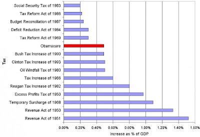
"Obama-care" biggest tax... What?

OK, you can oppose the legislation, but let's get the facts straight (that is, if facts matter to some people anymore!).  Kevin Drum's data turned into the following chart by Austin Frakt (see here).  Click on the graph to enlarge.

Total Returns Index as of June 30

The Capital Spectator (see here) has a nice summary of the Total Returns for Major Asset Classes as of June 30, 2012 (click to enlarge).