Well, as the Republicans gather in Tampa for their convention, I can't help myself. Much is being made of the "economic ideas" they are offering and the contrast of those ideas with the recent past. Indeed, Mr. Ryan claims to draw upon the work of some "brilliant thinkers" like Frederick Hayek in order to provide some intellectual "weight" for his proposals (think Medicare). Well, while you listen to the stirring speeches, keep the following quote in front of you:
Nor is there any reason why the state should not assist the individuals
in providing for those common hazards of life against which, because of
their uncertainty, few individuals can make adequate provision. Where,
as in the case of sickness and accident, neither the desire to avoid
such calamities nor the efforts to overcome their consequences are as a
rule weakened by the provision of assistance – where, in short, we deal
with genuinely insurable risks – the case for the state’s helping to
organize a comprehensive system of social insurance is very strong.
And who is the author of this quote? It is from Frederick Hayek's The Road to Serfdom. It makes you wonder if they read these books or just use them to decorate their offices or serve as props for TV interviews.
Tuesday, August 28, 2012
More data from Pew
Jordan Weissmann over at The Atlantic (see here) points us to one of the more interesting graphs in the Pew report on the middle class (see graph below, click to enlarge).

Weissmann says:
Here's the arc it captures: In the immediate postwar period, America's rapid growth favored the middle and lower classes. The poorest fifth of all households, in fact, fared best. Then, in the 1970s, amid two oil crises and awful inflation, things ground to a halt. The country backed off the postwar, center-left consensus -- captured by Richard Nixon's comment that "we're all Keynesians now" -- and tried Reaganism instead. We cut taxes. Technology and competition from abroad started whittling away at blue collar jobs and pay. The stock market took off. And so when growth returned, it favored the investment class -- the top 20 percent, and especially the top 5 percent (and, though it's not on this chart, the top 1 percent more than anybody).
Wednesday, August 22, 2012
Pew Research Center data on Middle Class
The Pew Research Center (see here) has released a new report on the status of the middle class. The report is entitled "The Loss Decade of the Middle Class," so you get the thrust of their findings. Below is a graph from the report (click to enlarge).

From the report:
"Fully 85% of self-described middle-class adults say it is more difficult now than it was a decade ago for middle-class people to maintain their standard of living. Of those who feel this way, 62% say “a lot” of the blame lies with Congress, while 54% say the same about banks and financial institutions, 47% about large corporations, 44% about the Bush administration, 39% about foreign competition and 34% about the Obama administration. Just 8% blame the middle class itself a lot."
Wednesday, August 15, 2012
Remembering Karl Fleming
Karl Fleming died this past weekend at the age of 84. His book "Son of the Rough South" has continued to have a significant influence on me. As a Southerner I continue to struggle with the history of my region. Mr. Fleming, in my view, took truth seriously - truth about the South and about himself. The L.A. Times said,

"Karl Fleming risked his life
covering James Meredith's entry into the University of Mississippi and the
deaths of three civil rights workers in 1964. He was badly beaten after the
Watts riots in 1965."
I will always be thankful for his contributions.

Monday, August 13, 2012
New research that is troubling
In a new book by Martin Gilens, Affluence and Influence: Economic Inequality and Power in America, the author reveals some findings that are quite troubling. On the blog The Monkey Cage (see here) he summarizes some of his findings (see graph below, click to enlarge).

On the blog he states:
"These findings suggest that political representation functions reasonably well for the affluent. But the middle-class and the poor are essentially unrepresented (unless they happen to share the preferences of the well-off)."

On the blog he states:
"These findings suggest that political representation functions reasonably well for the affluent. But the middle-class and the poor are essentially unrepresented (unless they happen to share the preferences of the well-off)."
Wednesday, August 8, 2012
Update on student loan debt
The Wall Street Journal (see here) has an update on the issue of growing student debt (see graph below, click to enlarge).

The authors state:
"According to a Wall Street Journal analysis of recently released Federal Reserve data, households with annual incomes of $94,535 to $205,335 saw the biggest jump in the percentage with student-loan debt from 2007 to 2010, the latest figures available. That group also saw a sharp climb in the amount of debt owed on average."
"The figures put this segment at the heart of a larger trend striking across income groups. More than three million households now owe at least $50,000 in student loans, up from about 794,000 in 2001 and fewer than 300,000 in 1989, after adjusting for inflation."
Interesting data on income in the U.S. by sex
Over at the blog Political Calculations (see here) there is a very interesting post on "average real income in the U.S. by sex." The graph below (click to enlarge) summarizes matters.

Here is an excerpt from the commentary:
"It's also interesting to note that since 1947, the annual average income earned by all individual women has nearly tripled, while the income for men has increased by a factor of 2.1. Meanwhile, the average income earned by all Americans has gone up by slightly less, doing just better than doubling in value during the time from 1947 to 2010."
Tuesday, August 7, 2012
Some data on health care spending
Aaron Carroll has a post at the blog The Incidental Economist (see here) in which he comments on a recent report "The Concentration of Health Care Spending" (NICHM report, see here). The report contains the following graph:
 Carroll comments on the graph as follows:
"That’s the cumulative distribution of personal health care spending from 2009. There are so many ways to talk about this. One thing to note is that the top 5% of spenders (some of the sickest among us) account for about half of all health care spending. More significantly, the bottom half of spenders (ie the healthier half) account for less than 3% of all health care spending."
"When we talk about incentivizing people to forego care, we’re talking mostly about healthy people. When we talk about consumer directed health care, we’re talking mostly about healthy people. We don’t want sick people to avoid care. We want to stop healthy people from consuming it. The problem is that healthy people consume so little care to begin with. If we could incentivize the healthier half of people to forego all their personal health care spending, we’d spend $36 billion less out of a total $1.259 trillion in personal health care spending. That would be a drop in the bucket. And no one – no one at all – thinks we can get people to stop all their health care spending."
Merrill Goozner at the Fiscal Times (see here) has a post about the same data. Goozner says, "The study serves as a cautionary note to advocates on the left or right who think eliminating waste or giving “consumers” a greater financial stake in health care decision-making will be magic bullets for holding down rising health care costs." Indeed it does! As I have said before, so much of the conversation about health care just isn't relevant to the everyday challenges people confront when accessing U.S. health care systems. From the claim that health care should be treated as a "market" (really, please, where have you been receiving your health care?) to the notion that costs can be cut while access increases and new techniques/procedures are welcomed. Mr. Carroll and his colleagues at The Incidental Economist constitute a small minority of experts that actually get it. And they pay attention to the data instead of ideology and platitudes.
More on the issue of income inequality
David Leonhardt over at the New York Times blog Economix (see here) takes another look at the issue of income inequality. He summarizes the data as follows:
"Over a longer term, though, the affluent have done extremely well. Since 1980, a household at the cutoff for the top 1/1,000th of earners — making about $1.5 million in 2010 — has received a pay increase of more than 100 percent, after adjusting for inflation. A household in the middle of the income distribution has received an inflation-adjusted raise of only 11 percent." (See graph below, click to enlarge).

"Over a longer term, though, the affluent have done extremely well. Since 1980, a household at the cutoff for the top 1/1,000th of earners — making about $1.5 million in 2010 — has received a pay increase of more than 100 percent, after adjusting for inflation. A household in the middle of the income distribution has received an inflation-adjusted raise of only 11 percent." (See graph below, click to enlarge).

Monday, August 6, 2012
David Wessel on taxes
David Wessel had a recent piece in the Wall Street Journal (see here) on the issue of taxes - how much and who pays. As is usually the case with Wessel's writing, he looks at the data. In the piece he says:
"Over the past three decades, Americans—including most of the rich—have paid less of their incomes to Washington. Top earners have received more of the income and paid more of the taxes; a growing number at the bottom have paid less or, in some cases, nothing."
The piece has a very informative graph (see below, click to enlarge).

Sunday, August 5, 2012
Report on "For-Profit" Colleges
Chairman Tom Harkin and the Senate Health, Education, Labor, and Pensions Committee released their report on for-profit colleges (the full report can be downloaded here). Dylan Matthews at the Washington Post provides us with a nice summary of key findings (see here). Some of these findings (with Matthews comments) are as follows:
- Graduation rates are abysmal: "The report finds that 62.9 percent of students who enrolled in an associate’s degree program at a for-profit college in the 2008-09 school year left before finishing their degree, and that the median student lasted only four months. A smaller majority — 54.3 percent – left bachelor’s programs before graduating, and 38.5 percent left certificate programs"
- The tuition is very expensive: "Bachelor’s programs cost an average of 20 percent more, and associate’s programs an average of quadruple public school tuition."
- Most of the revenue collected by for-profit colleges is supplied by the government: "In the 2009-2010 school year, $7.5 billion in Pell Grants, 50 percent of Defense Department education aid, and 37 percent of GI bill aid went to for-profits, money that, because of the programs’ much higher costs, financed significantly less education than it would have if directly at public or private non-profit institutions." In fact, the report shows that on average about 86% of the revenue collected by for-profit colleges is composed of Federal dollars.
Jobs and the Great Recession in perspective
Calculated Risk (see here) once again provides us with a superb graph clearly summarizing the depth of this recession and its impact on jobs (see graph below, click to enlarge).

Comments from Calculated Risk:
"This shows the depth of the recent employment recession - worse than any other post-war recession - and the relatively slow recovery due to the lingering effects of the housing bust and financial crisis."

Comments from Calculated Risk:
"This shows the depth of the recent employment recession - worse than any other post-war recession - and the relatively slow recovery due to the lingering effects of the housing bust and financial crisis."
Saturday, August 4, 2012
Interesting data from the Jobs Report
The Center on Budget and Policy Priorities (see here) highlights a finding from the recent Jobs Report (see graph below, click to enlarge).

The CBPP says:
Brookings provides us with the full picture (see here).

Brookings says:
"The ... chart reveals that once the American Recovery and Reinvestment Act (ARRA) began to phase down – and state and local governments struggled to balance their budgets – government employment dropped precipitously and now stands at 9.0 percent."
Yet, we still here it loudly proclaimed that the ARRA didn't do anything to improve the economy. Please..

The CBPP says:
"The cuts to public employment rolls also hurt the recovery.
When teachers and other public employees like police and firefighters
lose their jobs, they have to cut back on spending. Less spending means
fewer customers for businesses and a resulting drag on the recovery."
Brookings provides us with the full picture (see here).

Brookings says:
"The ... chart reveals that once the American Recovery and Reinvestment Act (ARRA) began to phase down – and state and local governments struggled to balance their budgets – government employment dropped precipitously and now stands at 9.0 percent."
Yet, we still here it loudly proclaimed that the ARRA didn't do anything to improve the economy. Please..
Good piece on Bernanke
BloombergBusinessweek (see here) has a good piece on Chairman Bernanke and the dilemma the Fed faces. It also contains a nice graphic of the players at the Fed (see below).

The following quote from the piece is important:
"Economists on both sides of the political aisle largely agree that Bernanke was right to throw a lifeline to banks and the shadow banking system at a time of maximum peril."
Why our political leaders can't get together on the issue of Fiscal Policy is deeply frustrating. Political positioning (Democrats and Republicans) and ideological foolishness (Republicans) are thwarting sound economic policies.
Thursday, August 2, 2012
What did we think would happen?
The Wall Street Journal (see here) has a piece that says "Under pressure to squeeze out costs, some of the U.S.'s biggest health
insurers are quietly erecting more hurdles for patients seeking medical
care" (see graph below, click to enlarge). What did we think would happen?

Aaron Carroll over at The Incidental Economist (see here) summarizes this well.
"The problem isn’t that we don’t know what to do. It’s that we don’t like the tradeoffs involved in any choices. We don’t like giving up anything – ever. So we keep casting about for the perfect solution to the problem. You know, the one where no one is ever denied any treatment, where no one is ever told they can’t see a certain doctor, where no one ever waits at all for elective care, where no one makes any less money, and where no government is involved at all. Oh – and it massively reduces spending and fixes the deficit."
Equality of economic opportunity
Timothy Taylor (see here) takes us through a new paper from the Stanford Institute for Economic Policy Research (see here) which examines "equality of opportunity" (see the table below, click to enlarge).


Taylor says:
"Here's a table that illustrates some of the movement to greater equality
of opportunity in the U.S. economy. White men are no longer 85% and
more of the managers, doctors, and lawyers, as they were back in 1960.
High skill occupation is defined in the table as "lawyers, doctors,
engineers, scientists, architects, mathematicians and
executives/managers." The share of white men working in these fields is
up by about one-fourth. But the share of white women working in these
occupations has more than tripled; of black men, more than quadrupled;
of black women, more than octupled."
New report from Pew Research Center
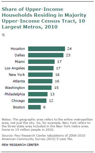
The Pew Research Center has a new report (see here) which analyzes the amount of "residential segregation" that has emerged over the past few years (see graph below, click to enlarge).
 The report states;
"Despite the long-term rise in residential segregation by income, it remains less pervasive than residential segregation by race, even though black-white segregation has been falling for several decades."
Which large metro areas have the most residential segregation?


"Despite the long-term rise in residential segregation by income, it remains less pervasive than residential segregation by race, even though black-white segregation has been falling for several decades."
Which large metro areas have the most residential segregation?
The drought and crop insurance
The Wall Street Journal (see here) has a piece on the extensive use of crop insurance, particularly its impact given current drought conditions. The graph below looks at the corn crop for the to 10 producers (click to enlarge).

The author of the piece says:
"The most popular insurance policy allows farmers to take advantage of those higher prices. Farmers can insure up to 85% of their average production at fall prices. So for every bushel the crop is short, a farmer can collect the going price in October. Nearly 70% of the nation's crops last year were insured, with levels for corn and soybean acreage even higher. Numbers aren't yet available for 2012."
Will the Fed act?
The Wall Street Journal (see here) has an interesting piece that considers the likelihood of action from the Federal Reserve given the slowing economic conditions (see graph below, click to enlarge).


Wednesday, August 1, 2012
CDC releases data on "Deaths in the U.S., 2010"
The CDC (see here) has released data from the "National Vital Statistics System" on mortality (2010). The release includes the following graph on "age-adjusted death rates by state" (click to enlarge).
The report states:
"States experience different risks of mortality. Hawaii has the lowest age-adjusted death rate (589.6 deaths per 100,000 population) of all the states, 21.0 percent lower than the rate for the United States (746.2). Mississippi had the highest age-adjusted death rate in 2010 (961.9), 28.9 percent higher than the U.S. rate."
"In general, states in the southeast region have higher rates than those in other regions of the country. Louisiana, for example, is typical of the region and has an age-adjusted death rate of 903.8 deaths per 100,000 population."
And the leading causes of death? The top five are: unintentional injury, homicide, suicide, cancer, and heart disease. How do the causes vary by age? See the graph below (from the report - click to enlarge).

Key findings from the report are:
- Life expectancy at birth is 78.7 years. Hispanic females have the longest life expectancy (83.8 years) followed by non-Hispanic white females (81.1 years).
- The largest decrease in mortality between the years 2000 and 2010 occurred in the age group under age 25 years (15.8 percent), followed by those aged 65 years and over (13.3 percent).
- States in the southeast region generally have higher death rates than those in other regions of the country.
- In 2010, the five leading causes of death were: heart disease, cancer, chronic lower respiratory diseases, stroke, and accidents. The ranking of conditions varies according to demographics such as age, sex, and race.
- The infant mortality rate reached a record-low level of 6.14 infant deaths per 1,000 live births in 2010.
Subscribe to:
Posts (Atom)